

Customising the My Account
Customising the My Account
Store admins can customise the subscriber's self-serve My Account experience, including branding, layout structure, promotional content, and empty states.
To access these settings, select My Account in the left sidebar. Always click Save changes in the top-right corner to publish your updates.
1. Theme & Branding

The theme section there are 2 different types of themes.
Pre-configured Themes
There are pre-configured color palettes available. Which include:
- Classic
- Dark
- Purple
- Green
- Ocean Breeze
- Coral Sunset
Custom Styling
When selecting Custom it will open a section where there will be many options available which to fine-tune the exact HEX colors.
· Brand Controls:
Brand**:** The primary brand color used for main CTA buttons, interactive links, active toggles, and key accents.
Brand (hover): The state color displayed when a customer hovers over interactive buttons or clickable brand elements.
· Background Layers:
Page background**:** The main canvas background color for the entire My Account page.
Surface**:** The primary fill color for cards, content blocks, and widget containers.
Surface (subtle): A softer background tint used for secondary containers, callout cards, table headers, or subtle section backgrounds.
· Typography (Text):
Text**:** Primary color for body text, section headers, labels, and general copy.
Text (inverse): Inverted text color designed for high contrast, used when text sits on top of dark surfaces or solid brand-coloured buttons.
· Borders & Lines:
Border**:** Standard, subtle outline color for card borders, input field edges, and horizontal dividers.
Border (strong): High-contrast border color used for prominent dividers, selected cards, or active focus outlines.
2. Configuring Empty States
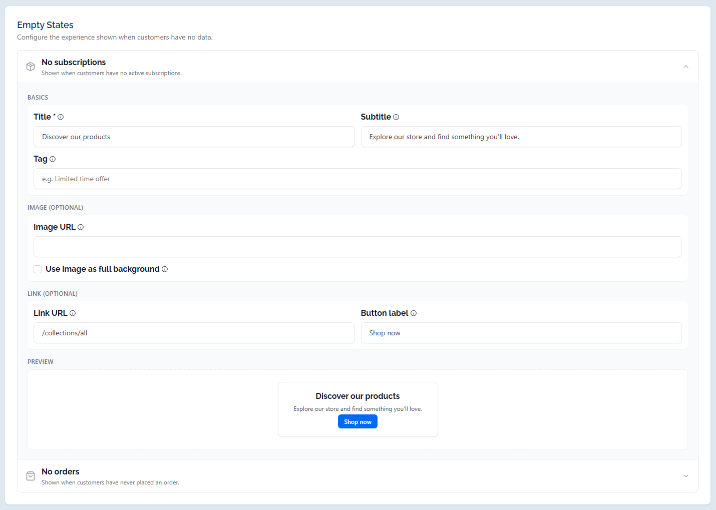
Customise what customers see when they log into their account without active subscriptions or past order history.
Empty State Triggers
- No subscriptions: Displayed when a customer has no active subscription contracts.
- No orders: Displayed when a customer has never placed an order.
Configurable Settings
Expanding either empty state reveals the following structured configuration panels:
Basics:
- Title**:** The primary headline text displayed to the customer (required).
- Subtitle**:** Secondary descriptive text appearing below the main title.
- Tag**:** An optional promotional badge text (e.g. Limited time offer).
Image:
- Image URL**:** Enter a direct image link to display an illustrative graphic or banner.
- Use image as full background**:** Check this box to stretch the image as a full background behind the content text block.
Link:
- Link URL**:** Target destination path or URL for the action button (e.g. /collections/all).
- Button label: Text displayed inside the call-to-action button (e.g. Shop now).
Preview:
- Displays a live, real-time visual representation of how the empty state card will appear in the subscriber portal.
3. Managing Portal Content
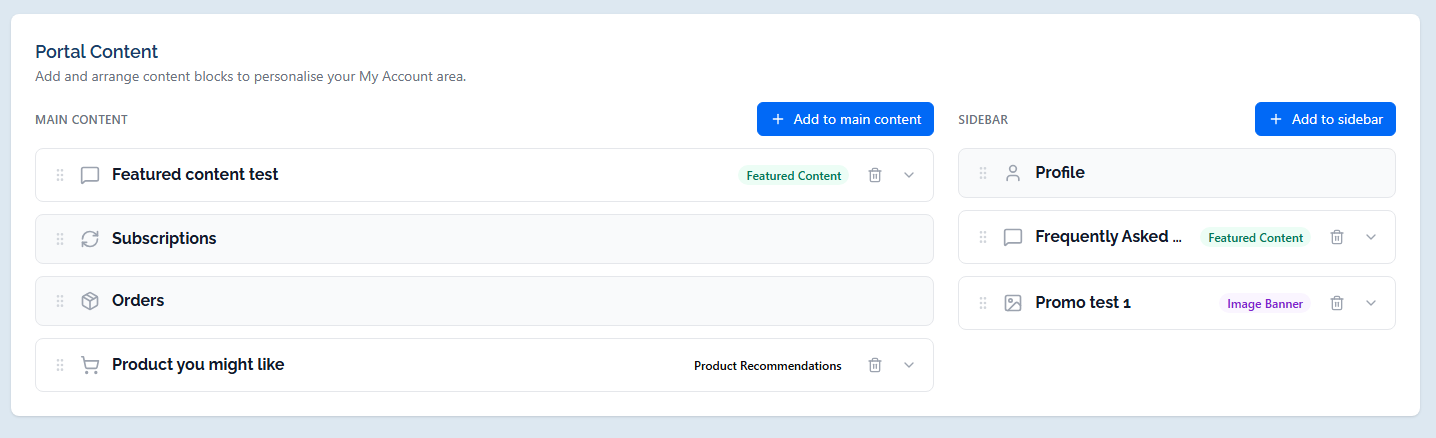
The Portal Content section allows store admins to build, structure, and personalise the My Account area for subscribers by adding and arranging custom content blocks.
1. Layout Structure & Zones
The account grid is divided into two distinct layout areas:
- Main Content**:** The primary, wide column designed for core customer widgets (e.g. Subscriptions, Orders) and major promotions. Click + Add to main content to insert new blocks here.
- Sidebar**:** The secondary side column reserved for utility cards (e.g. Profile) and secondary banners. Click + Add to sidebar to insert new blocks here.
Block Management: Drag the drag handle (::) on any block to reorder its position. Click the chevron arrow to expand/collapse block settings, or click the Trash Icon to delete a block.
2. Content Block Types & Settings
Clicking either Add button opens a modal with three available block types:
· A. Featured Content
Used to display prominent cards with background images, custom overlay colours, text, and call-to-action buttons.
Basics
- Title**:** Main card title.
- Subtitle**:** Descriptive copy placed under the title.
- Visible on**:** Device target dropdown (All devices, Desktop, or Mobile).
Image (Optional)
- Image URL**:** Direct image link.
- Use image as full background**:** Checkbox to stretch the graphic across the full card background.
- Styling Controls**:** Set custom swatches for Text colour, Overlay colour & tint percentage slider (e.g. 78%), Button background, and Button text.
Link (Optional):
- Link URL**:** Target web address or shop path.
- Button label**:** Text for the CTA button (e.g. Submit, Learn More).
Preview
o Real-time visual display showing exact card formatting.
· B. Image Banner
Displays a clean, standalone clickable graphic banner.
Basics
- Internal title**:** Administrative reference name for internal tracking.
- Visible on**:** Device target dropdown (All devices, Desktop, or Mobile).
Image (Optional)
- Image URL**:** Direct image source URL.
Link (Optional)
- Link URL**:** Target destination link when clicked.
Preview:
- Interactive preview of the banner graphic.
· C. Product Recommendations
Recommends specific store products to active subscribers via an interactive carousel.
Basics:
- Title**:** Carousel section header (e.g. Product you might like).
- Subtitle**:** Optional description line.
- Visible on**:** Device target dropdown (All devices, Desktop, or Mobile).
Products:
- What the button does:
§ Open a product page redirects user to the product page(PDP)
§ Add to a subscription open a modal to choose one of the subscriptions available to add the product. Only products with an active upsell can be listed here.
o Select Products:
To choose specific items to feature.
Selected products are listed with quick-remove (x) controls.
Preview
- Displays a live product card slider complete with Add to cart action buttons.
Pro-Tip: Every content block includes device visibility settings (Visible on: All devices, Desktop, or Mobile) and a live interactive preview editor.

